Monday 31 October 2011

Project 6: Clear Separation.

   The next project I'm going to attempt is based around the idea of clear separation between the elements that make up any decent landscape photo, these elements being the foreground, middle ground and background. Anyone can take a photo containing these elements but the knack is being able to combine them to create something which works on a completely different level, clearly a lot of this comes down to your compositional skills but its also about finding landscapes which speak to you artistically.


Tech. Details
F-stops- f/11
Exposure- 320secs
ISO- 400
Expo Bias- 0 steps
Focal Length- 18mm

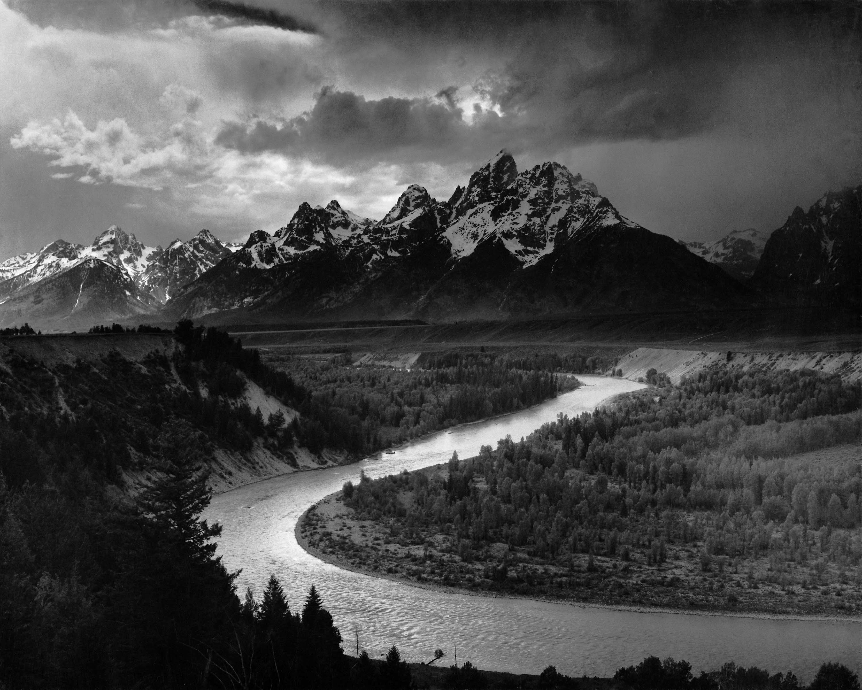
For the first half of the project I needed to create a shot which contained clear separation between the foreground and the background but at the same time there needed to be a graphical relationship between the two parts, a lot of head scratching went into this one because I knew I'd have no problems with the separation issue but coming up with something that worked graphically was going to be a stretch on my creative ability but in the end the photo I've produce I'm actually quiet proud off. This shot I captured in the Lake District about a quarter of the way up Scarfell Pike, during much of the climb I tried to remain aware of the landscape around me searching out elements that I thought would work well together. The first part the lake in the background was an obvious point of interest but I need something in the foreground that would anchor the shot, my first thought was the pathway itself but the view seemed a little empty and just didn't feel right. Luckily the answer was slowly heading up behind me in a group of people so I waited and as they court up captured shots of there progress until I had this image (to be honest I was happy to have the rest as its not as easy as you'd think carrying photography gear up a mountain).  The divide between the foreground with the people climbing up the mountain side and the lake and hills disappearing into the background is pretty clear but its the graphical part that I'm most happy with. Here what I did was use the triangle created by the two hillsides in the foreground to connect to the view in the background, the shape just draws the eye naturally through the scene.


Now comes the more difficult section of this project with the idea of combining foreground, middle ground and background elements, I'd already done a fair amount of research to help me because I did worry about the fact that my foreground and middle ground elements would end up blurring together if I didn't get the composition just right. This is easily done but with the rules that I set out to follow in my previous entry hopefully things would turn out ok.


Tech. Details
F-stops- f/14
Exposure- 500secs
ISO- 800
Expo Bias- 0 steps
Focal Length- 18mm

For my first attempt at this kind of shot I tried a vast landscape view using my wide angle lens, as I planned I first located a good background here being the rolling Derbyshire hills, then within this view I found a point that would make up my middle ground here being the village in the valley then finally it was the more difficult part of finding something to place in the foreground while still capturing the other two elements. In the end I went for a simple gate way because I like the way it frames the other two parts. The problem I have is that I'm not really that happy with how the image has come together, what's happen is something I'd never foresaw in that the middle ground and background have kind of become one. I focused to much on stopping this from happening in the foreground and didn't pay enough attention to everything else going on in the scene make up. On consideration I think the problem here is that the village is just too small within the scene meaning its just swallowed up in the landscape, obviously the foreground has to be reasonably dominate but the other sections have to stand out just as much. I think its a back to the drawing board with this one.    

Saturday 22 October 2011

Planning For Project 6: Clear Separation.

   For this project there are two parts, the first I explain and look at in more detail in my next entry which will include my work for this project but right now I'm more interested in the second part. For this I need to create an image which combines the foreground, middle ground and background, to me this sounds relatively simple but then after a minute I started thinking how often do I actually take landscape photos that clearly combine all three parts and the honest answer is it isn't very often. What I find when I look at my work is that I have no problem combining foreground and background into a well formed image but when it comes to adding the third part it just isn't something that I find I'm that comfortable in achieving so what I want to do is look at how other Photographers and even artists have worked to produce these kind of images.

   In the course material it mentions as a good example the painting The Sermon On The Mount by Claude Lorrain which you can see below.

Paintings Reproductions Lorrain, Claude The Sermon on the Mount, 1656

I'm know art buff so I couldn't tell you whether its a brilliant piece of art or not but what I do know is that he's produced a nice balanced image with the people in the foreground and the rugged landscape in the background countering the weighty mount in the middle ground of the scene. I can guess that with the focus of the image being in the middle it could have been a bit difficult to get this balance because he might have though of placing the hill slap bang in the middle but this wouldn't have worked as well as off setting it to the left and then balancing the foreground and background on the right of the scene. Although there are hundreds of other examples more then likely out there in the art world what I'm more interested in is how photographers have approached combining these three areas.


Galen Rowell.
Some good examples of the kind of work I've been looking for can be found if you look at the photos produced by Galen Rowell, there are some amazing images in his collection of work but the ones I want to focus on are Old Wagon beneath Mt. Tom, Round Valley, Eastern SierraReflection Pond, Denali National Park and Musk ox Skull, North Peary Land, NE Greeland National Park. I've chose these three because even though there are main more examples in his work these are the one's that stand out to me the most. The first image Old Wagon stands out for a couple of reasons, first the use of the light highlighting the wagon in the foreground and the mountains in the background then there's the feeling of emptiness and how remote this landscape is only increased by the overall cool colouring in the photo (I know that there's is a strong orange produced by the sunlight but I think the overall image feels quiet cold even with this because of the presents of the frost on the ground and wagon). The way he's used the wagon in the foreground, bare trees in the middle ground and mountains in the background have created a nice balance and with the way he's composed the three parts together creating a triangular relationship helps guide the viewers eye through the scene smoothly. With Reflection Pond it's a little less in your face then the last but just as effective, in the foreground you have the red flowers and grass then in the middle ground you have the lake and reflection before finally in the background you have the hill line and sky. It maybe doesn't work as well as my first example but its the colours in this image that I think make it work, its the reds and oranges contrasting against the heavy blues,greens and purples that make you look and appreciate the work. The final example Musk ox Skull is different again from the first two because here he's used a different view point to create a strong visual effect. If he had got low down to the skull there's every chance it would have got lost in the tundra surrounding it but by getting right up close he's managed to have it solely in the foreground with the vast Arctic tundra making up the middle ground before you reach the mountains in the background. Here he's used the lightness of the skull in the foreground compared to the darkness of the mountains in the background to make it stand out and add depth.
In Rowell's work there's much more to look at because of the depth of his landscape and wildlife work and he's definitely someone that I'll return back to in later work for inspiration and to have a closer look at his methods.

William Neill.
Although there isn't as many examples in his work the ones that I did find stood out because of how he'd used the light to his advantage when working in Black and White. The first shot to look at is call Sunrise on the Hana Coast, Koki Beach, Island of Maui, Hawaii here the first think to jump out at me is the great sense of movement captured by clearly using a long exposure. I love the flow of the misty water and the rushing of the clouds over head but that isn't what I'm looking for right now its the way he's used the elements within the view to make the foreground, middle and background. To produce this you got the rocks in the foreground then the moving sea making up the middle ground before finally you reach the out crop far out in the background. The other thing I like about this image is the way he's used the light to create silouettes throughout the scene to balance the amount of bright areas created by the reflective nature of the water and the brightness of the sky. The second photo I want to look at is Sand dunes at sunrise, Monument Valley Tribal Park, Arizona, here again he's made use of the early morning light and again its clever in its use. The way this shots made up is by having the sand dunes in the foreground the rest of the desert in the middle and then the peaks of Monument Valley making up the background, what he's done cleverly is by using the direction of the lines in the dunes he leads you into the image and then by using the light to brighten the dunes while darkening the background in shadow gives added depth and texture to the shot.
As I've already said there isn't as many example in his work but what I found have been just as useful because now I have a much better understanding of how to structure my own images to create these 3 layered results.

   I've come up with a few point to keep in mind which should help me to produce good photos in this style from the research I've just done-

  1. Use a wide angled lens- Its not impossible to produce images with a foreground middle and background using a telescopic lens but to get more depth and to avoid the image feeling very flat (unless that what I'm after) using a wide angle is best.
  2. Finding suitable landscapes- The best way to maybe to build these kind of landscapes is to first find the middle ground and background for the image and then within this view find a point that can be used as a foreground interest.
  3. Get up close with foreground object- The last thing I want is my foreground to blend into the middle ground blurring the divide so the best thing to do is to get up close and personal.
  4. Neutral Density filter could be handy- As I've see with a few examples above having the background appear darker then the foreground can increase the feeling of depth so maybe it would be a good idea  to include my ND filter in my bag for this project.
Following these ideas can only help improve my chances of creating good images now its just down to me getting out there and seeing what I can produce.   

Thursday 20 October 2011

Depth & Perspective.

   Moving into the next section it's back to an old favourite for any aspiring Landscape photography in the theme of Depth and Perspective, now by this point I've probably in one form or another covered this area in the majority of course I've done but it's possibly one of if not the most important aspect to understand and put into practise in landscape work. Don't get me wrong I'd don't claim in anyway to be an expert or even now to fully grasp why some of the ideas I'm going to look at in a minute work but if you can get a good enough grasp the creative possibilities are endless.


Linear Perspective.
One of the first way of creating depth in a photo and maybe one of the easiest is using the idea of Linear Perspective, in basic terms this is when you use parallel lines like walls,hedge lines even the edges of road and paths that are heading away from you and meeting at a vanishing point in the distance. This is one that I do tend to use quiet alot because it occurs more often then you think, just look around you parallel lines are everywhere just asking to be used. The best way to capture this effect is by using a wide angled lens because if you try it with a telescopic one it just compresses the field of view giving the effect a flatten appearance.


Above you can see this Linear perspective in action, as you can see there's more then just one single set of parallel lines at work from the path way to the sides of the green house to even the roof its self all giving the shot the added depth that I'm looking for using the effect.


Diminishing Perspective.
This next idea is similar in a way to Linear but where it differs is that instead of looking for parallel lines here all I'm after is a single line of similar sized objects moving away from the camera.


Here I've used the fence line to create depth in the way I've described above but also in away the actual pathway also work's because this is linear perspective. What I also like about this shot is the way the clouds create shadows on the cliff top in the distance giving added depth in another way which I'm going to look at next.


Tonal Perspective.
The idea here is that you use the light to create depth with the image because of how our brains intemperate what we see. How this works is that if we see a light object against a dark background the brain tells us that this object must be closer because it's brighter then the surrounding area, I know I thought I was doing a photography course but there's a little bit of psychology involved as well.


Here you can see this idea at work, with the way the light illuminates a single area it makes this section stand more forward then the rest of the image. Its not maybe the best example I could have come up with but you can kind of get the idea. What I would have liked to show you here would have been say a building picked out by the sunlight but you can always rely on the weather to try your patience.


Colour Perspective.
In away this is similar to tonal but this time its the warmer colours against cooler ones that create the idea of depth.


Bright yellows and oranges against a very dark background are always going to stand out more but its more the reason that its the clear focus of the shot that makes this image work.


Sharpness.
The idea of using sharpness to create depth relies on the fact that what ever is in focus is closest and then as blurring increases this means that things are moving further and further away from the camera. To create this kind of effect is relatively simple because all you need to do is alter the f-stop setting of your camera to create a very small field of focus.


Here you can see this in action because the focus is on the front of the scene and then by having the f-stop set at f/7.1 I created a nice gradual blur into the background giving good depth to an image that on another occasion would have appeared very flat.


   What all these process present to you as a photographer is the methods to put depth into your work but its being able to diagnose the situations where each method can be of best use to you that's key, practise and a good eye are essential and these can only be gain through time and experience but using these processes as I've found can vastly improve your work and add new dimensions to even the most basic scenes.


Monday 17 October 2011

Channel Mixing.

   I'd used a little Channel Mixing on the previous project but to get a better understanding of how channel mixing can effect my work here's a short explanation of what it does.


Above is a pretty straight forward shot of a Bee feeding on some Lavender, its a good image in this form with good colour contrast between the purple and the yellow plus the reds and greens in the background. It's nice and sharp and I'd be perfectly happy displaying it in this form but what would it look like converted to Black & White using the Channel Mixing controls?

In my version of Photoshop it took me a few minutes to find where the Channel Mixing controls were hidden because you can always bet it isn't where you would expect it, first I look under Edit but it wasn't here then I did find it under the Image tab.

1.

2.

3.

Above are three versions of the same image that by making small alteration within the Channel Mixing tool have produced varying effects. To produce these effects all I did was make alterations to the amounts of Red, Green and Blue by moving the individual sliders until I liked what it was doing to the image. In photo 1 the setting I used were RED -70%, GREEN +200% and BLUE -30%, by doing this I ended up with the yellow and green areas remaining bright while the purples and reds became much darker. To me the green area in the background has now become to over powering and makes the image seem unbalanced because of the strong white area in the background. For my second version I tried to resolve this problem by using the setting RED 0%, GREEN 0% and BLUE 100%, although this fixed the problem in the background the bee now appears completely black but I gained a little more contrast within the lavender. In my final version I think I've about got it spot on using the settings RED +34%, GREEN +66% and BLUE 0%, now I've removed the problems in the background which means the focus stays on the foreground while there's still good contrast between the light and dark areas of the bee and the lavender plant and flowers.

   What you can see here is what a useful piece of software Channel Mixing can be giving you the control over individual areas within the scene so that in a Black & White image you have a great amount of control over the tones throughout. This will be a definite advantage when doing my major project if I do choose to go down this path.

Sunday 16 October 2011

Project 3: Experiments In Key.

   Right now I've looked at what High/Low Key photography is its time to have a crack at it myself. For this project I'm asked to produce two distinctly high key images and then two distinctly low key all in Black and White, the subject matter is completely up to me which is one of the reason I picked this project in the first place, the second being it gave me the chance to play around with the black and white medium. On first glance I imagine for me the Low key images will be the easier of the two to produce because I like the more moody more dramatic images that you find in this style, I could be wrong but it'll be a good learning process finding out.


High Key Photos.


Tech. Details-
F-stops- f/36
Exposure- 1 sec
ISO- 800
Expo. Bias- 0 steps
Focal Length- 160mm


For my first high key image I tried looking for a subject that was bright in colour or as it turned out at least the same light shade throughout so that as a black and white image the light areas would be converted to white. With my 7d I found that by using the live view function I could work much better because I could see before I'd even taken the shot whether it was going to work or not with the camera set to monochrome. What I've tried to do is us a bit of an abstract composition to make the subject a little more interesting because if i'd shot the whole of the face it just didn't work for me. One thing I like about shooting a photo in high key is the affect it has on the subject, in this case it makes the stone face appear much softer because of the lack of any shadows to enhance the texture.


Tech. Details-
F-stops- f/4
Exposure- 1/100secs
ISO- 100
Expo. Bias- 0 steps
Focal Length- 25mm

This is a close up of a Giant Dandelion head but by capturing it in High key I think it looks more spidery and almost web like. Again as with the face above the effect softens the photo making it appear much less sharper but at the same time the there's enough contrast between the seed heads to produce a balanced structured shot. Also again you could say it's a little abstract but I think this is one of the reasons it works because you're not quiet sure what you're looking at.

   This half of the project as I expected I found to be the most difficult to complete, what I found difficult was that it's hard to produce landscapes in this way because I kept ending up with very over exposed images that lack any real quality. To get round this problem as you can see I went more macro because this mean't I was looking at things on a much smaller scale, a smaller field of view mean't less light and shadow to worry about and I felt I had more control over the exposure because of this alteration.


Low Key Photos.


Tech. Details.
None Available

This shot I captured while at an evening match at Old Trafford on my phone but I really liked the results and though it fit nicely into this section. With the way the ground was lit it was producing strong shadows in the stands while lighting a small area of the pick making a nice focus point with the players warming up. Add to this the blurred motion of the people and some players plus a good tonal range and I think I got a nice piece of work here in the low key range. It isn't as sharp and crisp as I have liked but this is more dew to the camera then to the lighting of the scene, the main thing is the thought it has the more dramatic feel that I'm looking for with these two images.


Tech. Details-
F-stops- f/14
Exposure- 1/500sec
ISO- 800
Expo. Bias- 0 steps
Focal Length- 22mm

For my final image I gone all out to create as powerful a photo I could possibly by choosing a subject that equally reflects this. This is the Shot At Dawn memorial to all the men that were shot by firing squad for refusing to fight during the First World War, many of these men are now thought to have been suffering from shell shock or post traumatic stress or even a combination of the two so it's a very powerful memorial in the first place. By using the light provided and then playing around a little within Photoshop with the Levels and Brightness/Contrast controls the end results are what you see above, I'm really pleased with the contrast between the statue and the background although the one problem I do have is whether there's maybe a little too many light tones present for it to be a true Low key image. I did attempt to less these tones but found that the shadows took over to much a wrecked the feel of the shot completely so in the end I've gone for a half way solution. I like it and think it's the best photo in the section but it's by no mean's perfect.

   All in all I've really enjoyed this project its stretch my understanding and changed the way I might look at a subject moving forward when I work again in black and white. I think I've definitely found a love in black and white photography that I did know I had and it has changed my view that I like maybe to do my whole major project in this fashion. Clearly I still have a lot of room for improvement probably more in the High Key range but this gives me somewhere to work as I plan where to go next with my work.

Thursday 13 October 2011

What is High Key & Low Key Photography.

   High Key and Low Key Photography isn't something that I'd ever come across before so i think its probabley best to do so research first to get a clearer idea of what i'm actually looking at producing.
   In the most basic terms High Key photos are very bright with mostly white tones and little shadow whilst Low Key is the complete opposite in that they are dark with very little lighting with strong black tones and lots of shadow. Tone wise High Key images can be defined as giving the feeling of  being fresh, clean, smooth while Low Key tend to feel sinister, mysterious, edgy.

File:High key baby.jpg

Above is a typical example of the type of high key images that you see, strong light creating little shadow but the eyes become the focus of the shot because of the contrast with the rest of the tones.


File:Low key Nina.jpg

And here you see a typical low key image, lots of shadow and dark tones very moody compared to the high key shot.

I've tried looking at other peoples work to help my understanding of this form of photography and what i found was that i ended up being drawn to the work of Ansel Adams in particular, in his work he had such control over the tonal range that he produced breath taking imagery that has truly stood up to the test of time. He seems to have produced the majority of his work in the Low key and from the two examples below you can see how he's used the lighting and the shadow produced (more in the second image then the first) to give the scenes really texture and mood which is something I'll be aiming for with my own images. What I like about his work is the effort and time that he must have put in to produce them, none of his subject in the the American mid west were that accessable during the period he work (there probabley not that easy to reach in some repects even today) but he manage to get his equipment in position and then waited until he had the lighting just right before shooting to get the image he was after. I can't begin to imagine the time he must have spent in some place's just waiting for the conditions to be right.

File:Adams The Tetons and the Snake River.jpg


File:Canyon de Chelly panorama of valley from mountain.jpg

The one advantage I do have over people like Adams is that while he created his images using a collection of different developing techniques I have Photoshop to help me create the tonal differences I'm after. Yes the majority of work is still done with the camera and the exposure settings I can now play around with it much more using the software available. For example i can use the levels control, brightness and contrast even the hue/saturation controls to effect my final work and failing these I could even go so far as adding digital filters.

This is one of those projects that I'm really glad I pick to attempt, to begin with it seems quiet straight forward but when you dig around and get a better understanding of the actual process involved you see there's alot more to it. You can't just shoot a scene in black and white and over or under exposing it, you have to have an understanding of the lighting and know how to use it to get what you want, even in a studio situation this is true but outdoors its even more vital. I can't wait to see what I come up with.

(photos taken from Wikimedia Commons)

Saturday 8 October 2011

Decisions.

   I come to a point in this course where some key decisions need to be made about what I do next. What I'm confronted with is 4 themes each containing 2 projects, from these i need to choose 3 projects to undertake which will make up my second assignment the question is which to do?
   In the first theme Projects in Colour or Black and White the two projects are Colour Accents and Experiments in Key, now Accents I've already covered a number of times in other course so straight away I feel this isn't an option because I can't see myself learning anything new covering old ground that I feel I'm already pretty versed in but then on the other hand Experiments in Key is something completely new and bares a further look. The project seems to be based around the use of black and white with lighting and exposure techniques thrown in, straight away this grabs my interest for one reason I've started to consider doing my major project completely in black and white as it isn't a style that I've ever used alot before so this project clearly will give me some much need practise. One down two to go.
   The next theme is Photography As Documentation with the two projects within call A Persuasive Document and An Impartial View. What these two projects seem to by asking is for you to produce a photo essay first in Persuasive on a subject that you have a strong personal opinion and view on and in Impartial you take a subject  and by as objective as possible on it. I think both of these could be really good to attempt but I'm not really sure there my kind of thing, I sat for quiet a while considering the kind of subject that I would or could if possible cover for either of these projects and found that I really couldn't come up with many at all and the ones that I did I didn't feel I had enough conviction in to mount any kind of project work behind so at this point I'm going to avoid this pair and hope for something more in my line in the following sections.
   The third theme finds us looking at Depth and Perspective with the first project being called Clear Separation where you asked to produce images which have separation between foreground and background but still have some graphical relationship and in the second part produce images where you have foreground, middle ground and background in one image. The second project in this section Eliminating Depth Clues asks you to produce images with a flatten effect produced by using long focal lengths. Both these projects i could see myself doing because they'd give me the chance to work in one of my favourite types of photography landscapes, its one of the main reasons I first took up photography because I wanted to capture the great outdoors how I see it and if I could impress this view on others more the better. In the end I've decided that Clear Separation is by far the more interesting of the two and offers far more possibilities to me creatively. Two down on to go.
   The final theme is Gesture and Expression with the first project being called The Decisive Moment, this pretty much is self explanatory in that you need to capture a scene and then choose which image is the decisive moment in the collection explaining why you made this chose. The second project is called Change, in this case you have to choose a subject and then capture change over a period of time. Of all the project for this assignment i think these two are probably the most intreging to me because there a little different from anything that I'd normally do. I'm leaning towards Change but I can also see the possibilities with the other project so I think for now I'll leave the final decision until i reach this point in my work.
   What I've tried to do here is select three projects that have some relationship to what kind of photography i already enjoy undertaking but at the same time things that will stretch my ability and expand my work to. I was a little apprehensive of this section to begin with but know I'm really quiet looking forward to it and can't wait to get started.

Monday 3 October 2011

Assignment 1 Alterations.

After sending my work away for my first assignment my tutor recommended a few changes that could improve my work so far, these i've taken on board and have attempt to make the changes such as firstly altering the font style of my blog. For me i found it easy to read but of course all people are different so i've gone for a much more normal and straight forward one which i think still gives it a distinct look but is clearly easier for others to read. Next she recommended presenting my Theoretical Studies as Word documents because again this would make them easier to read through. This did create a small problem because i couldn't find away with Blogger to actually put a word document onto it ( a little bit strange i know but if anyone has any ideas how you can do this i'd love to know). In the end i've got round the problem by using Google Docs and then placing the links to the files below, i can see they look better for this just hope this way of presenting them is all right by my tutor.
The final thing that she asked was that i expanded on my study on Pictorialism which i've attempted to do.

LINKS.


Theoretical Study On Pictorialism
Theoretical Study On New Objectivity
Theoretical Study On Straight Photography